Key Takeaways
- Near-unanimous user support marks the release of Plex’s new mobile UI preview, with visual upgrades and improved customization.
- The layout gets high praise, with Plex employee BigWheel indicating that most in-demand missing features are on their way.
- iOS users can test the preview app via the TestFlight program, but Android users need to sideload the APK or wait for a Play Store Testing fix.
Few events unite dedicated tech communities like major UI updates, which typically set off chain reactions of users distraught over seemingly pointless interface changes and a reintroduced learning curve. In a mystifying, reassuring turn of events, the new Plex mobile UI overhaul preview just dropped to an astonishing chorus of longtime DIY streaming fans singing the praises of its various upgrades. For the moment, Android users need to sideload the APK or just wait patiently, though, as the test app is facing a “bit of an issue with Google Play approval,” according to one Plex employee.

Related
How to choose the right Plex server: PC vs. NAS vs. Shield vs. Raspberry Pi
Some are cheaper, some are better
Welcome changes, a long time coming
With a full release expected in early 2025
User feedback began with almost unanimous support for the redesign, something nearly unheard of in demanding communities like the Plex user base. And the devs have caught a decent amount of flak for past UI updates falling short of expectations, so this isn’t just a niche community just being nice.
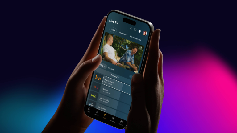
The initially most obvious change is the interface’s visual skin, which now falls in line with the recently updated companion apps Plex Photos, Plex Dash, and Plexamp. Among the more useful updates already noticed, users are seeing the appropriate artwork populate for movies and TV shows on their servers, as well as logos and backgrounds all appearing automatically in the app — which may seem small, but greatly boosts the overall experience.
The preview is currently optimized for phones but works with tablets, with the tablet layout on its way.
Users almost universally praise the new overall layout, with other improvements including more focus on the My Libraries tab containing your collected media, and an upgraded home page customization toolkit called Favoriting.
Promisingly, an oft-present Plex employee called BigWheel has been responding to the various reported missing features, almost every time assuring worried users that the features in question are either planned for preview or release, or sharing the new ways to activate them compared to the older public release. This understanding and flexibility likely has something to do with the update’s positive reception.
There are, of course, a couple of caveats. First, it’s only a preview, and the various still-in-progress features mean it can’t deliver the full experience, so don’t delete the actual Plex app just yet. Second, the positive feedback comes mostly from iOS users through the TestFlight program for now, as the Play Store hasn’t yet posted the test app listing, and the Plex team only made the APK available a short time ago. Plex users willing to give it a shot, though, will almost certainly like what they see.

