Key Takeaways
- YouTube’s new hyperlinked comments add functionality by offering users more context on specific topics.
- The feature has begun rolling out on Android and iOS, but appears to lack consistency.
- Hyperlinked keywords will appear in blue with a magnifying glass icon next to them.
We have a love-hate relationship with YouTube. All of our favorite creators upload to the platform, incessantly drawing us back to the Google-owned streaming giant. However, it’s often that the platform takes decisions that just don’t sit right with the users.
Let’s ignore the fact that it charges for an ad-free experience — that, too, on a platform that relies primarily on user-generated content. In the past two months alone, the platform has made head-turning decisions like increasing the price of its already-expensive subscription in certain countries, testing pause screen ads, and making it harder to like or dislike a video on the platform’s smart TV app.
Related
The YouTube app for TVs just made it harder to like or dislike a video
YouTube on TVs now has nested like/dislike buttons
The streaming giant is now looking to add more functionality to the video comment section, and while its intentions with the update might be clean, its implementation isn’t. Originally a limited experiment, hyperlinked comments are now appearing in comment sections more widely, as spotted by 9to5Google.
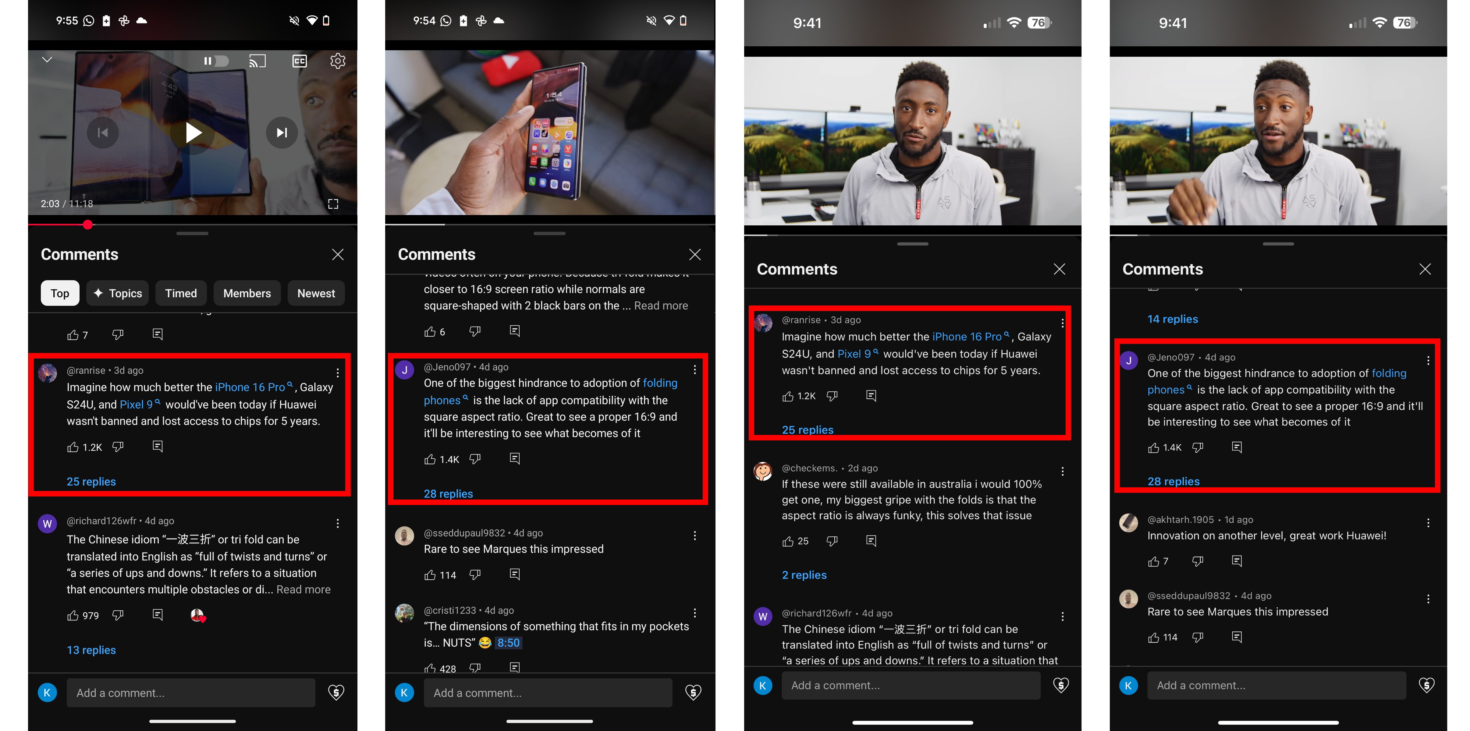
It’s worth noting that these aren’t hyperlinks added by users. These links, highlighted in blue with a small eyeglass icon, appear on specific keywords that YouTube has relevant content for. Tapping on one essentially opens a new page within the app with search results for the keyword.
The hyperlinking algorithm might need some fine-tuning
The change is live for me on the YouTube app for Android version 19.42.34. It is also live on version 19.42.1 on iOS.
As seen in the screenshots above, words like Pixel 9, folding phones, and iPhone 16 Pro all have a blue hyperlinked text color alongside a tiny magnifying glass icon, highlighting that the link is clickable, and that YouTube has relevant videos on the topic that might be worth checking out. Once tapped, the video you were originally on continues playing in a miniplayer while you check out the keyword’s video search results.
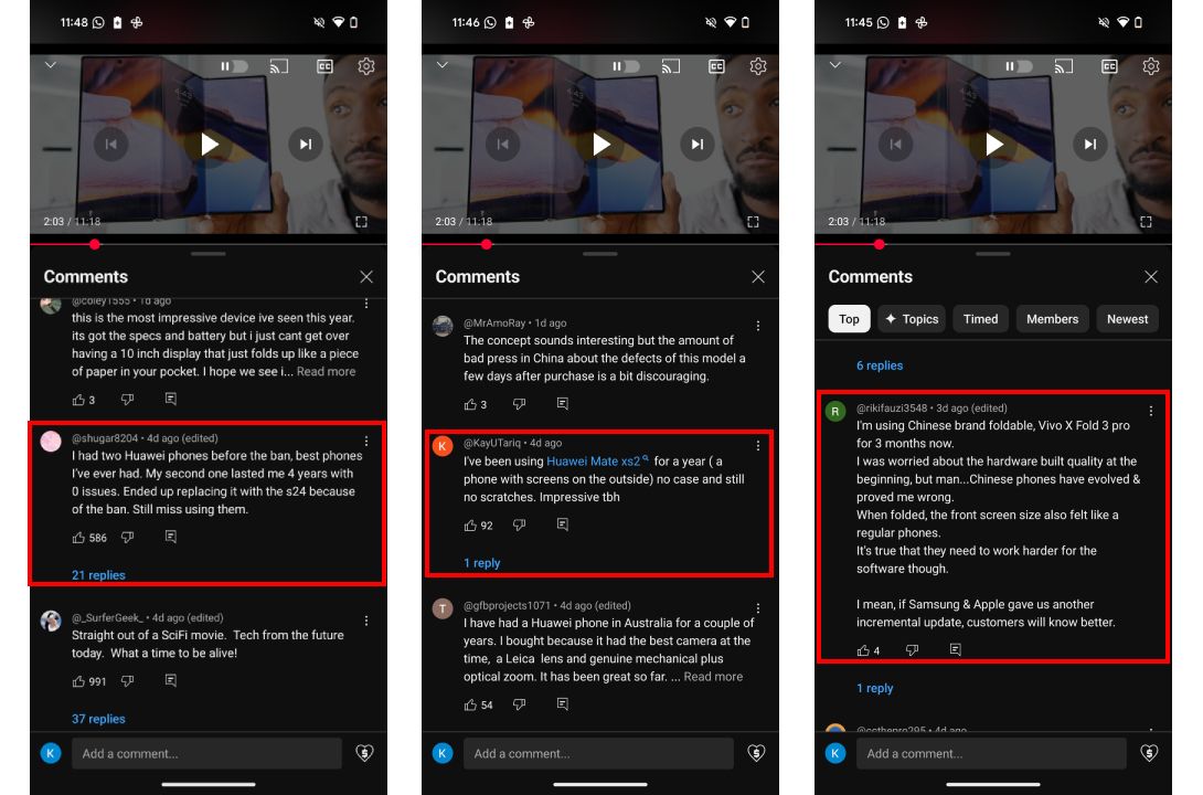
In theory, the feature does make comments on YouTube somewhat more useful — but how they function isn’t entirely clear. As seen in the examples above, YouTube decided to highlight the Pixel 9 and the iPhone 16 Pro, but I spotted other comments with names of phones that weren’t highlighted.
A pattern that we spotted was that the platform only highlighted device names if they were typed out in full. For example, P9P won’t get the hyperlink treatment but Pixel 9 Pro would. Similarly, ‘s24’ isn’t enough to be hyperlinked, but Galaxy S24 might be. But then, we spotted comments that typed out device names in full that weren’t hyperlinked. Vivo X Fold 3 Pro, for example.
The reason behind the inconsistency isn’t clear. It’s not like YouTube doesn’t have videos about Vivo X Fold 3 Pro on the platform.
Hit or miss
Okay, so we’ve established that “Pixel 9” is a keyword that YouTube’s algorithm deems ‘hyperlinkable,’ while other device keywords might not make the cut. However, inconsistencies persist. “Pixel 9” comments on MKBHD’s videos are hyperlinked, but “Pixel 9” comments on AndroidPolice’s YouTube videos aren’t. You’d imagine that maybe YouTube’s algorithm is currently only hyperlinking keywords on channels with huge followings, but that too isn’t the case.
The same AndroidPolice comment section that left “Pixel 9” un-hyperlinked gave the very next comment with a “OnePlus 12” keyword the blue colored magnifying glass treatment, as seen in the screenshot below.
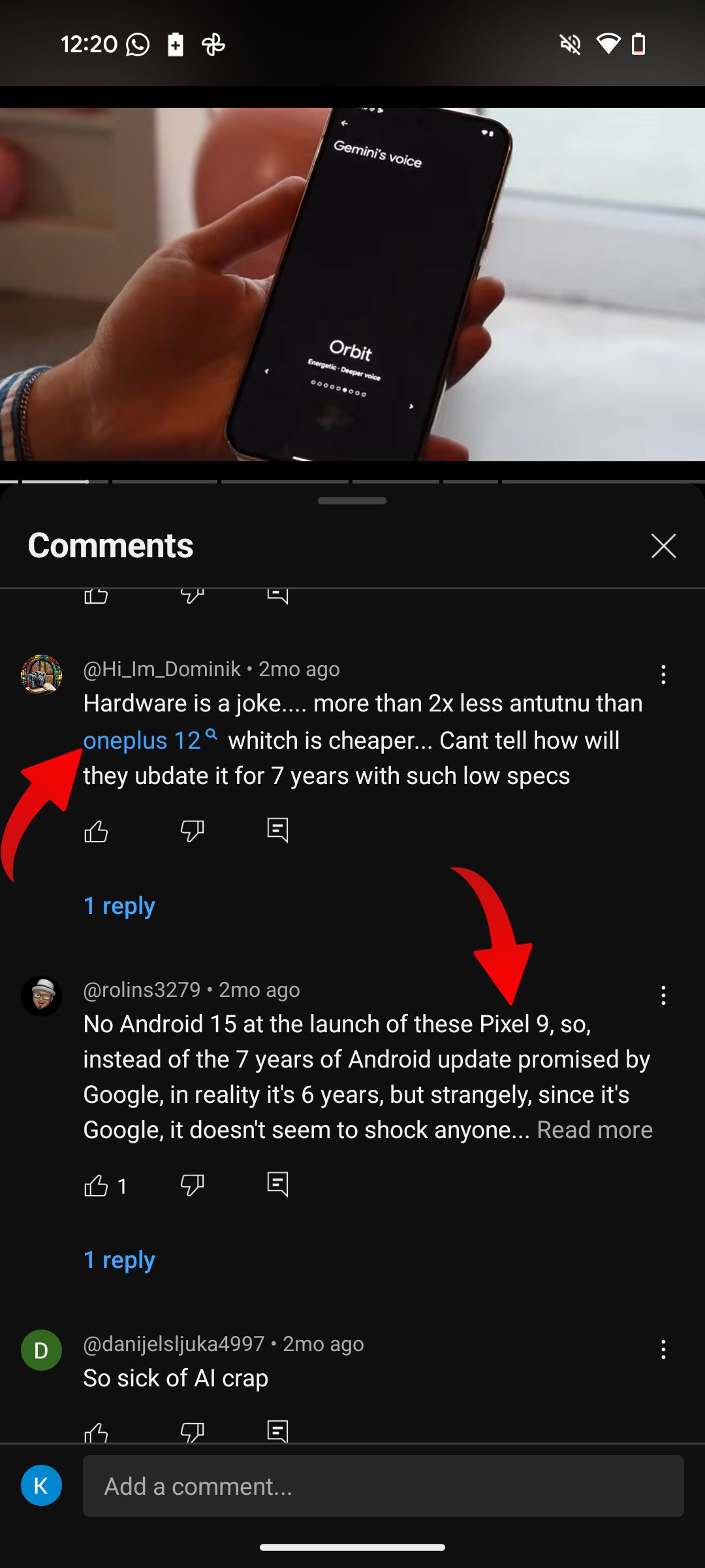
Oh, and while we’re on the topic, getting rid of the magnifying glass might be a good option. Blue text is universally recognized as a hyperlink indicator and should suffice. It is currently unclear if YouTube will hyperlink successive comments with hyperlinks. If so, get ready for a cluttered comment section with hindered readability.
